At this year’s Step Up Together Summit a group of brand strategists and designers from Innovation Protocol had the honor of holding a main stage session. We gave an overview of what we do at Innovation Protocol, sharing about the practice of brand strategy and design. The most exciting part was the opportunity to provide a behind the scenes look for the entire Step Up community into our partnership with Step Up on their recent brand refresh. If you missed the panel or simply want a refresher, here’s a high-level recap of Innovation Protocol’s history with Step Up and an overview of how we collaboratively arrived at the new Step Up brand and brought it to life for you all to experience!
The right time for a refresh
We’ve been lucky enough to have built a relationship with Step Up over the years and love participating in their events. We are constantly inspired by the passion of the Step Up team and the work they do. This year, we had the opportunity to collaborate with Step Up on their brand refresh.
Step Up and IP felt like this year was the right time for a brand refresh for a few reasons. Step Up is heading into their 25th anniversary, which is a major milestone. It has also been about 10 years since Step Up’s last refresh. And, as we all know, there has been a lot of disruption, evolution, and change over the past few years post-Covid. For Step Up that meant transitioning to remote programming and operating outside of its traditional after school programs. Remote programming also meant expanded reach and as a result Step Up began developing a national and even international presence.
With all this powerful evolution, Step Up decided they wanted to embark on a brand refresh to create a brand that felt truer to who they are today. Our goal as brand strategists and designers at Innovation Protocol and in our collaboration with Step Up was to build a brand that authentically represents who they are today, honoring the growth and evolution they underwent, while giving them runway to grow into the brand they want to be.
How we arrived at the concept of “The Guide”
During our rigorous discovery research process and internal and external stakeholder interviews, it became clear to us that Step Up believes in individualized success. What we mean by this is that Step Up promotes the success of the individuals they work with, not a pre-defined, one size fits all type of success.
This holistic outlook on success and the path to get there means Step Up focuses on both personal and professional development, working to build both confidence and career readiness. Step Up plays the role of a strong supporter and guide that helps girls of all ages define what success looks like to them and then outline the concrete steps they need to take to get there.
Their powerful and impactful role as the guide served as the strategic basis for the brand direction we chose. It clearly communicates who Step Up uniquely is and what they authentically provide. We also used this idea to establish Step Up’s brand position which informed the creation of many new aspects of the brand such as a new vision and mission statement to a unique tone of voice that Step Up could use across their communications.
Visually expressing “The Guide”
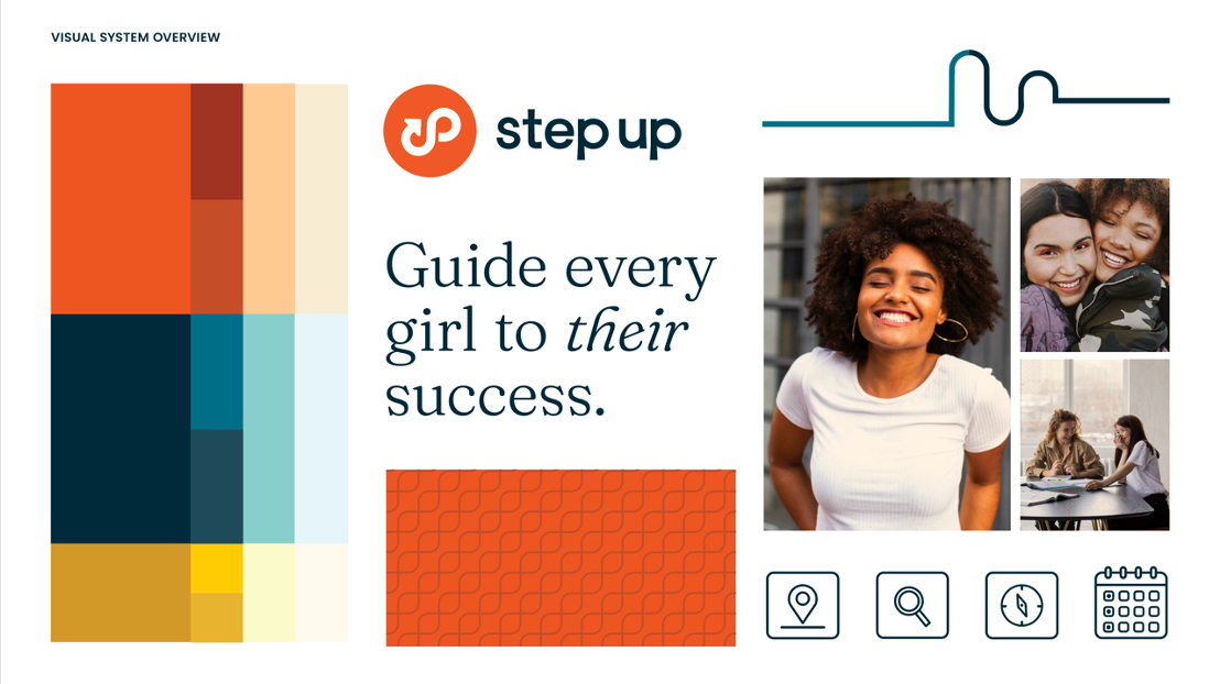
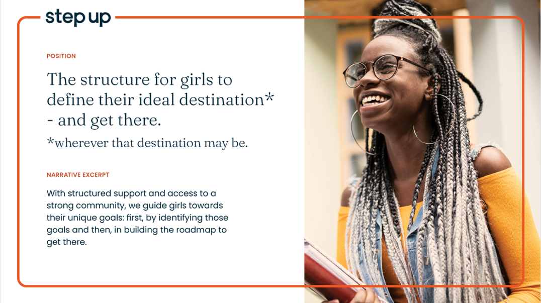
Step Up’s visual system is designed to bring the concept of “The Guide” to life in many strategic ways. A visual system is like a toolkit and is comprised of elements such as color, type, photography, symbols, and other graphical elements. You’ve likely seen these elements come together on their website or in a newsletter.
To break down a few key elements, we leveraged the graphic element of the path which is more than a symbol of each girl’s unique journey to success. It can also be used to frame images and to lead viewers from one piece of content to the next. For photography, we focused in on each girl who’s proud and confident on her journey, along with moments where they’re immersed and engaged in the community.
You’ll also notice an updated logo. There are two parts to this logo, the infinite path symbol and the wordmark that reads “Step Up”. Knowing that Step Up is here to support you as you identify and embark on *your* path to success, Step up’s symbol represents a path to growth, and how it is everchanging and never ending. For the wordmark, by making the font all lowercase and in a sans serif font, the logo and the rest of the system feels approachable and appropriate for Step Up’s audience.
It was an honor to work with Step Up on their new brand. Our goal was to create a brand that feels both new and refreshed but familiar and true. We hope this gives you deeper insight into our strategic approach to brand and can inspire your brand’s next step!